Videos
Responsive Flexbox
In this example, we change the percentage of flex to create different layouts for different screen sizes.
Resize the browser window to see that the direction changes when the screen size is 800px wide or smaller.
1
2
1
2
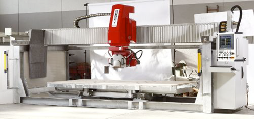 |
Videos QUBO |
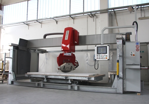 |
Videos QUBO-T |
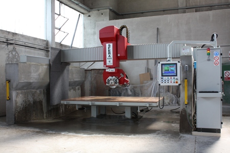 |
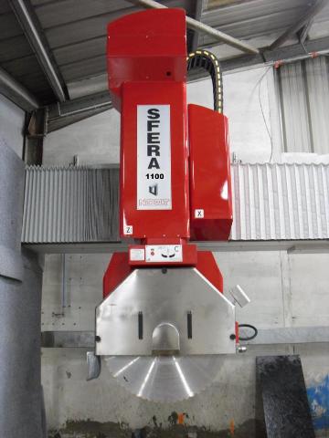
Videos SFERA 725 |
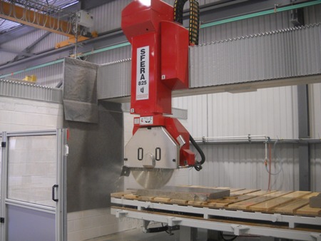 |
Videos SFERA 925 |
 |
Videos SFERA 1200 |
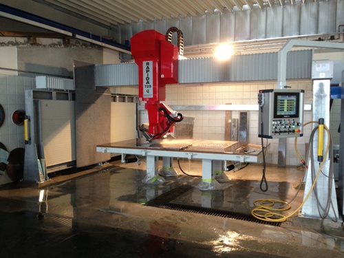 |
Videos RAPIDA 725 |
Publiziert am: Mittwoch, 04. Januar 2023 (156 mal gelesen)
Copyright © by NOAT Deutschland
[ Zurück ]